Deleted
Deleted Member
Posts: 0
|
Post by Deleted on Jan 17, 2007 23:00:36 GMT -5
I just painted two scrap plastic pieces...Kind of funny...I painted them both, let dry (like 10 minutes apiece (NICE!)) and moved them so my cat won't die from trying to clean them...Well, in the moving of them, I kind of forgot which was which...So I repainted them and MADE SURE to label them...
I will take some pics of them tonight, but I am not great with computers, so I will have the pics up by tomorrow evening...But, I will give my quick analysis (non-biased of course)...
To be honest, they both really do look great (and would both work for the GM)...When looked at from a few feet away (or farther) they almost look identical...BUT right next to each other they do look a little different...I don't think that there is enough difference for everyone to go "I HAVE to change and repaint my GM"...Not that everyone or anyone would anyways...But they are REALLY REALLY close...The satin claret wine isn't as satiny as I would like, but it's not bad...it does have a LITTLE more of a purple-y shade in it, but not enough to call it a purple...I still looks very red...
I'm actually very happy with that too...Since I will probably use the claret wine, one because it is easier to find in the stores around me and two, just to be different...BUT what I like about it is that it is not enough of a difference to make a big deal for the kama...They will still match fairly well...Someone who's VERY picky might not agree, and that's fine, but I think if whichever color anybody/everybody picks will look good with the vinyl for the kama...pics tomorrow...
J
|
|
|
|
Post by admin on Jan 17, 2007 23:48:09 GMT -5
Thanks for the report, I look forward to the photos. I'm actually considering repainting all of my GM armor, perhaps when I get some additional upgrade parts in (shoulder bells, forearms, etc). It's not a lot to paint either, which will take a bit of the sting away. Captain Ferin is on my workbench for this year, so that will require certain upgrades anyways, and I may as well paint his helmet a more correct color anyways to get things going! Of course, I need the helmet first.  |
|
|
|
Post by pghfett on Jan 18, 2007 3:30:45 GMT -5
They must be very close if you mixed them up and cannot tell them apart !!! LOL Great work on this ! It appears it will come down to the quality of the coverage, drying time and durability of the paint more so than anything else. The pics will really tell all. Great work once again!  |
|
Deleted
Deleted Member
Posts: 0
|
Post by Deleted on Jan 19, 2007 0:04:18 GMT -5
Sorry, my grandparents are going out of town for a few months and are leaving Saturday which I completely forgot about until tonight, but I will load the pics asap (probably tomorrow night) sorry...The pics look pretty good though
|
|
Deleted
Deleted Member
Posts: 0
|
Post by Deleted on Jan 19, 2007 21:37:38 GMT -5
Got the pics right here...Sorry it took so long...But I don't know how to load them onto this discussion (reply) topic
|
|
|
|
Post by admin on Jan 19, 2007 21:50:38 GMT -5
Got the pics right here...Sorry it took so long...But I don't know how to load them onto this discussion (reply) topic If you want, you can email me the pics, and I'll put them up for you. davre.gamob@gmail.com |
|
Deleted
Deleted Member
Posts: 0
|
Post by Deleted on Jan 19, 2007 21:52:45 GMT -5
that would be great except for the fact that that is why I wanted to do them this way (in the forum) because whenever I try to send people pics over the internet (email) as a attachment, they NEVER get there... Any advice on that?
|
|
|
|
Post by admin on Jan 19, 2007 21:55:42 GMT -5
that would be great except for the fact that that is why I wanted to do them this way (in the forum) because whenever I try to send people pics over the internet (email) as a attachment, they NEVER get there... Any advice on that? I can't help you there, but go ahead and try. You can always upload them to the GM flickr account. PM me for directions. |
|
Deleted
Deleted Member
Posts: 0
|
Post by Deleted on Jan 19, 2007 23:55:28 GMT -5
(PM SENT) Everyone, I finally got off of my fat butt and took/loaded the pics...I know that the pics all have the same caption that explains it, but incase the captions don't load right, the left one or two pieces are ALWAYS the burgundy (what everyone has been using so far) and the right one or two are ALWAYS the claret wine...I made sure of the consistency so there would be no (little) confusion...
I also would like to change my mind on something...I know that I said the other day that after I first painted the scrap pieces I liked the claret wine better...After they dried, I am not so sure...It looks good in it's own right, but I think it is actually a little FARTHER from the correct (canon/movie) GM color than the burgundy...VERY slightly darker than the burgundy...Like I said, I am not sure which I will eventually choose...I also was thinking that I might use BOTH (layers) for fading/weathering purposes...
|
|
|
|
Post by admin on Jan 20, 2007 0:32:26 GMT -5
Here are Shadoweclipse's photos. The captions are by him: 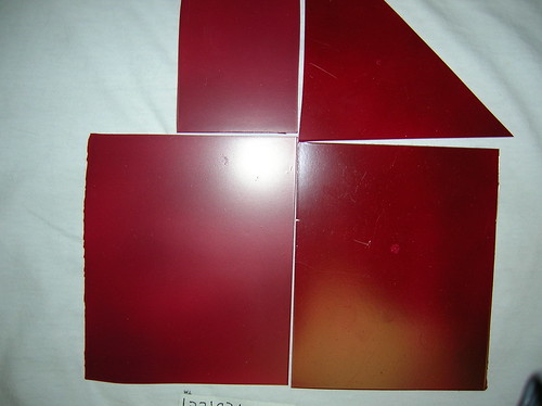 The two on the left (small rectangle and big one on left) are the burgundy that you guys have been using already...The two on the right (large rectangle and triangle) are the claret wine...This pattern/configuration/arrangement are the same for ALL of the pics... 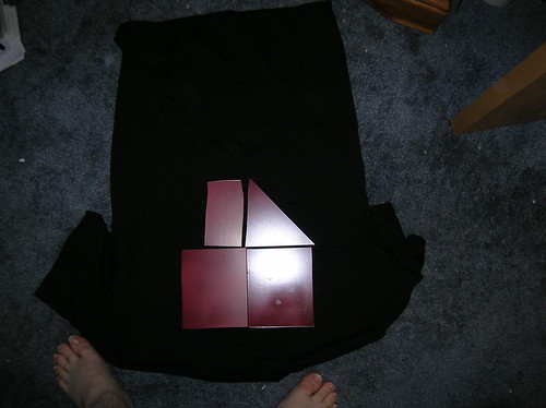 The two on the left (small rectangle and big one on left) are the burgundy that you guys have been using already...The two on the right (large rectangle and triangle) are the claret wine...This pattern/configuration/arrangement are the same for ALL of the pics... 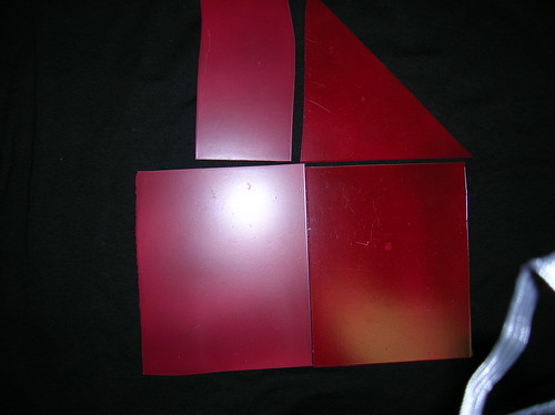 The two on the left (small rectangle and big one on left) are the burgundy that you guys have been using already...The two on the right (large rectangle and triangle) are the claret wine...This pattern/configuration/arrangement are the same for ALL of the pics... 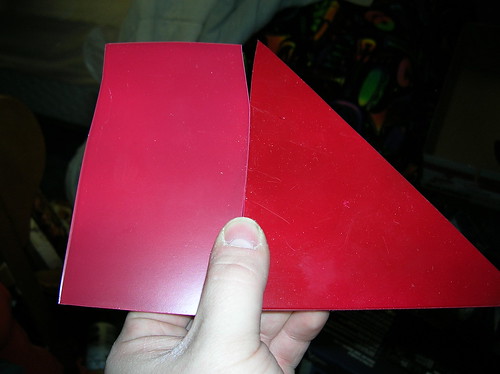 The left one is the burgundy, the right one is the claret wine... 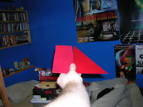 The left one is the burgundy, the right one is the claret wine... Here are a few GM images for comparison: 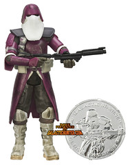 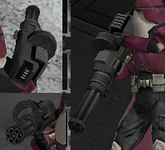 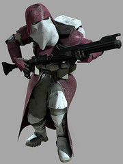 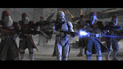 Please consider the action figure and BF2 images to be more or less "accurate" since they are offical LFL licenced products, so it can be assumed that the makers had official references. Also consider that the screen capture has environmental lighting which can greatly alter our perception of actual color. |
|
|
|
Post by pghfett on Jan 20, 2007 0:37:57 GMT -5
Capt, can you photoshop a GM image next to the swatches for comparision ? And a BIG thankyou to [glow=red,2,300]Shadoweclipse[/glow] for doing the ultimate color test |
|
|
|
Post by admin on Jan 20, 2007 0:42:06 GMT -5
I'd like to thank Shadoweclipse for taking time out of his day and taking the initiative to do this for the forum. True dedication.
Something we need to take into consideration when viewing these photos is that the flash might be making the colors not what they actually are.
However, there can be some certainty made about these two colors, since there certainly is some contrast:
The Burgundy is NOT the same Burgundy that Krylon makes. This Rust-Oleum Burgundy is has more purple it in, whereas the Kyrlon as more red.
The Claret Wine is more red than the Burgundy, and is deeper in shade. So if you go with the Burgundy, you may have to darken it up a bit with some black before you weather it. The Claret Wine will not require a pre-darkening.
I'm gonna stay away from a judgement call on this, I won't say which is more accurate. I'm gonna say it's a matter of preference, basically to each his own. Both look good to me. My armor is currently more along the lines of the Rust-Oleum Claret Wine pictured here (though, in reality, it is Krylon Burgundy), though I may change to the Rustoleum Burgundy in the future.
Yesterday, I went to Home Depot (for other reasons) and I stopped by the paint department. Sure enough, I did find both colors. I didn't have any GM pics with me to compare the two, but they both looked like they had their pros and cons. By cap color (and the paint companies are good about accurate colors on their caps), the Burgundy did look really light in comparison to the Claret Wine. I'd like to buy a can of each and do my own person color comparison for my personal suit so I can better determine which way I want to go (I have a new chest, and will be getting a phase II helmet soon).
Mike, as far as a visual comparison to the colors, I wouldn't recommend comparing the GM images to these photos. The GM images are under CG "natural lighting" so we see the colors perfectly, where as these photos appear to have harsh flash effecting the actual colors of the paint. But I'll go ahead and edit the post with the first Sith Snapshot.
|
|
|
|
Post by pghfett on Jan 20, 2007 1:09:20 GMT -5
Thanks Dave, Shadoweclipse has motivated me...... I'll go to my local hobby store and I'll pick up some PPR and model railroad 1oz bottled colors and see what kind of "special" paint colors they have and post the swatches here (considering I'm painting a Fett bucket). These hobby paints are specialized for model making and come in a large amount of custom colors and brands. I'll even pick up some Humbrols as well, for those who don't want to rattle can the paint on. This should cover all paint types / brands available - and more importantly -gives me a reason to go back to the hobby shop LOL I also wanted to share that weathering makes a gigantic impact on the end paint up result. This is why I wanted to see the pic next to the colors. Start light and darken down - If we can find the color under the weathering - bang !!! |
|
Deleted
Deleted Member
Posts: 0
|
Post by Deleted on Jan 20, 2007 7:31:55 GMT -5
Everybody: you're welcome. I like doing stuff like this so you know, it's cool...
But I also want to clarify something...The burgundy I got for this IS the Krylon burgundy (Krylon Satin Touch Burgundy #3503)...It may not look the same as the one which you guys have been using, but it is... The burgundy is Krylon and the claret wine is rust-oleum, just so everybody knows...Something to keep in mind though...I took these pics in my bedroom which has fluorecent lights...And with that kind of glare it is hard to get a true color match...I didn't really have a choice: I took a few other pics but the light wasn't bright enough and they didn't come out very well at all, so this was my best option...The two pics that look the most like the real thing and which turned out the best are the first two (top two)...If you look at the top (smaller) of the two pieces, THAT is way closet to what they really look like...I am also not much of a photographer, so if ANYONE wants a small swatch to see in person let me know, I can ship one to you anytime...
It may not look the same as the one which you guys have been using, but it is...Also keep in mind that painting is NOT one of my strong points...
I DO agree with the captain though, that this is a preference...Remember I haven't started my armor yet, so I was throwing this out there as a option to anybody who has armor and maybe needs to repaint and also as an option for those like me who have not done one yet...Just for comparison...
|
|
|
|
Post by admin on Jan 20, 2007 12:39:34 GMT -5
Huh. Ok so there is a definite difference between the Krylon Burgundy and the Rust-Oleum Claret Wine. Now I'm curious to see what the Rust-Oleum Burgundy looks like, because my memory of that one's cap color looks like the Krylon paint in the pictures - basically it has that purple-ish look to it.
So I'd say, once I try it out, we may have three colors to choose from:
Krylon Satin Burgundy
Rust-Oleum Burgundy (I noticed my HD only had gloss)
Rust-Oleum Claret Wine Satin
|
|


